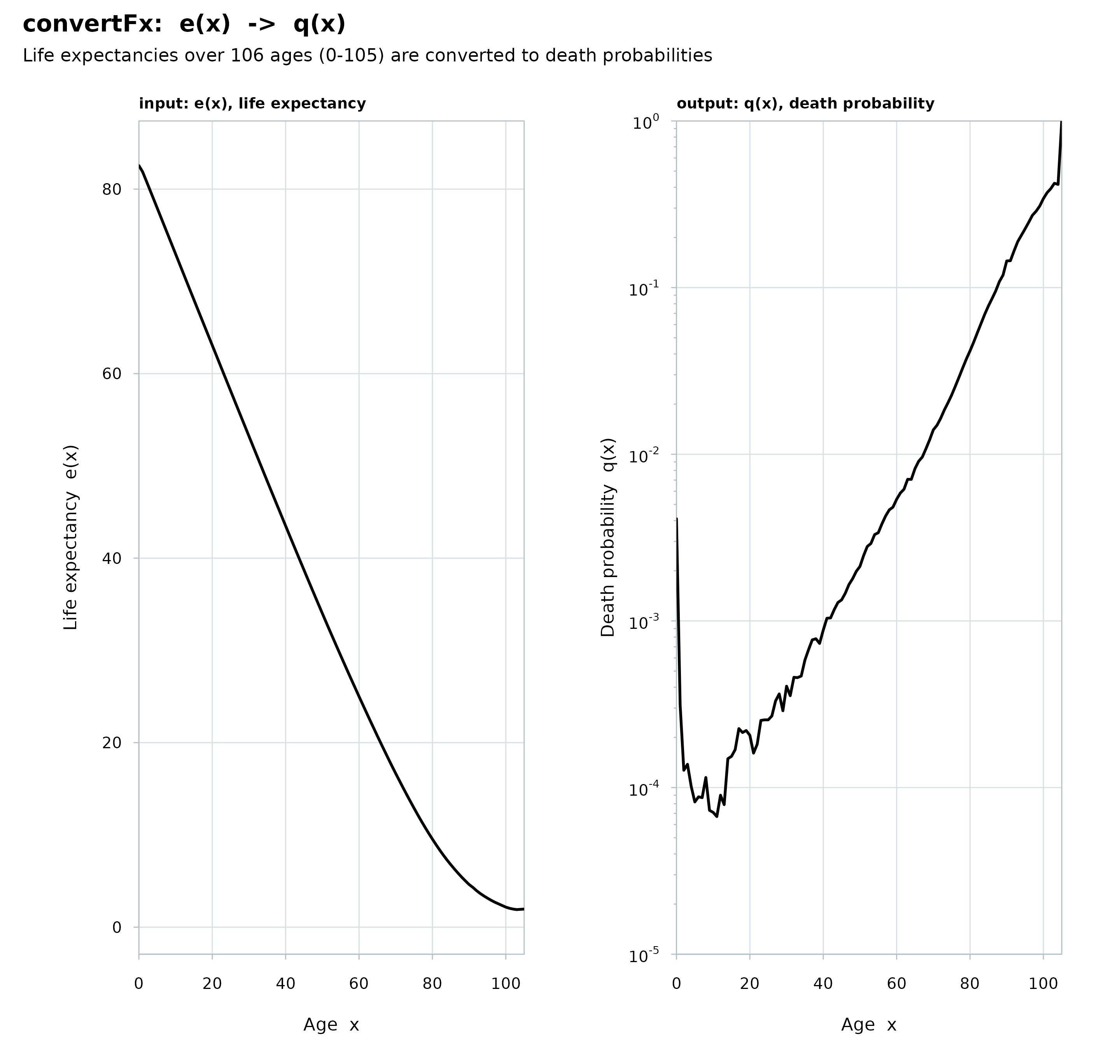
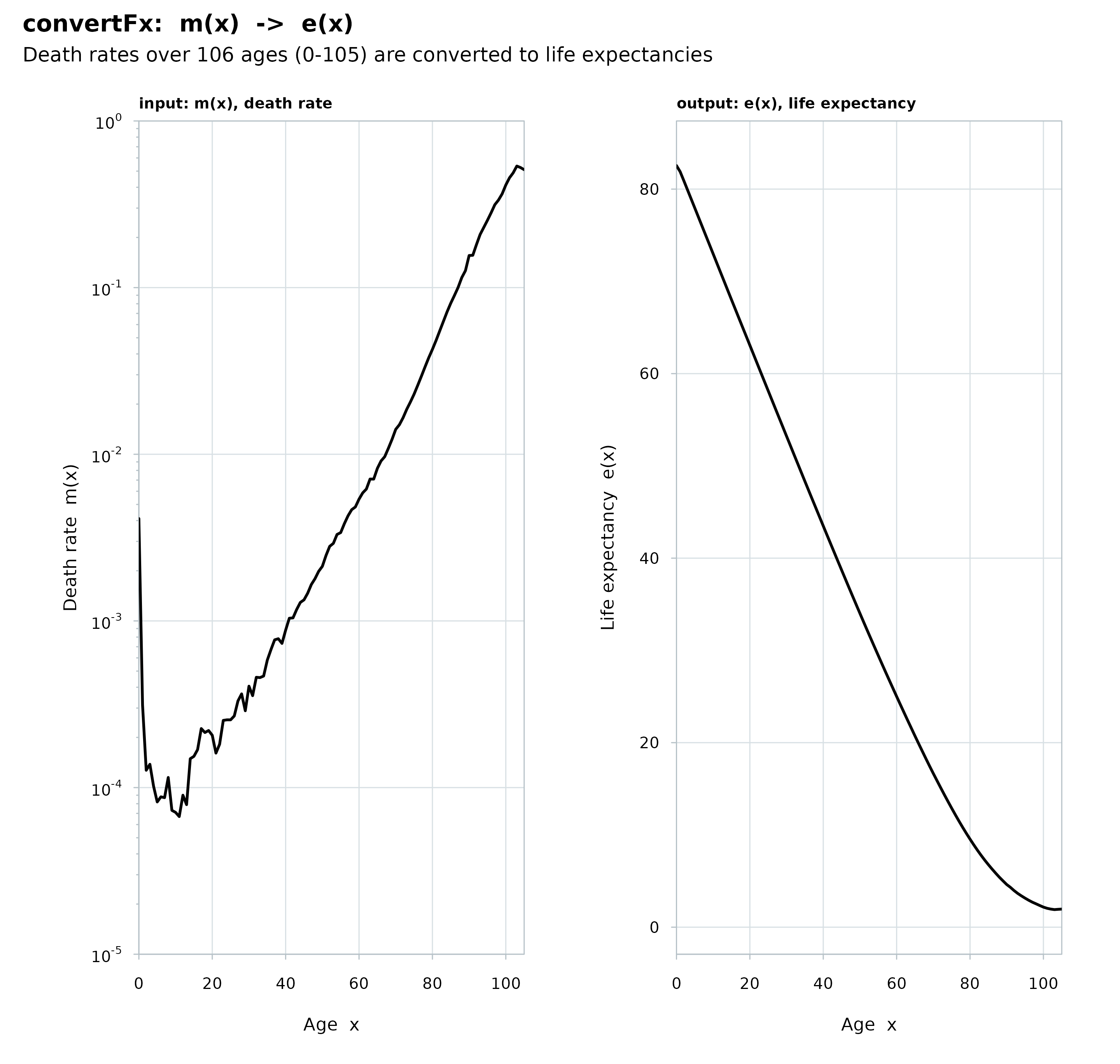
Draws the result of convertFx in the house style: the input
indicator in one panel and the converted output indicator in the other,
sharing the age axis when they are stacked. Rates and probabilities
(mx, qx) go on a log scale. A matrix input draws one curve per
column in both panels.
Usage
# S3 method for class 'convertFx'
plot(x, split = NULL, ...)
Arguments
- x
An object of class
"convertFx", as returned byconvertFx.- split
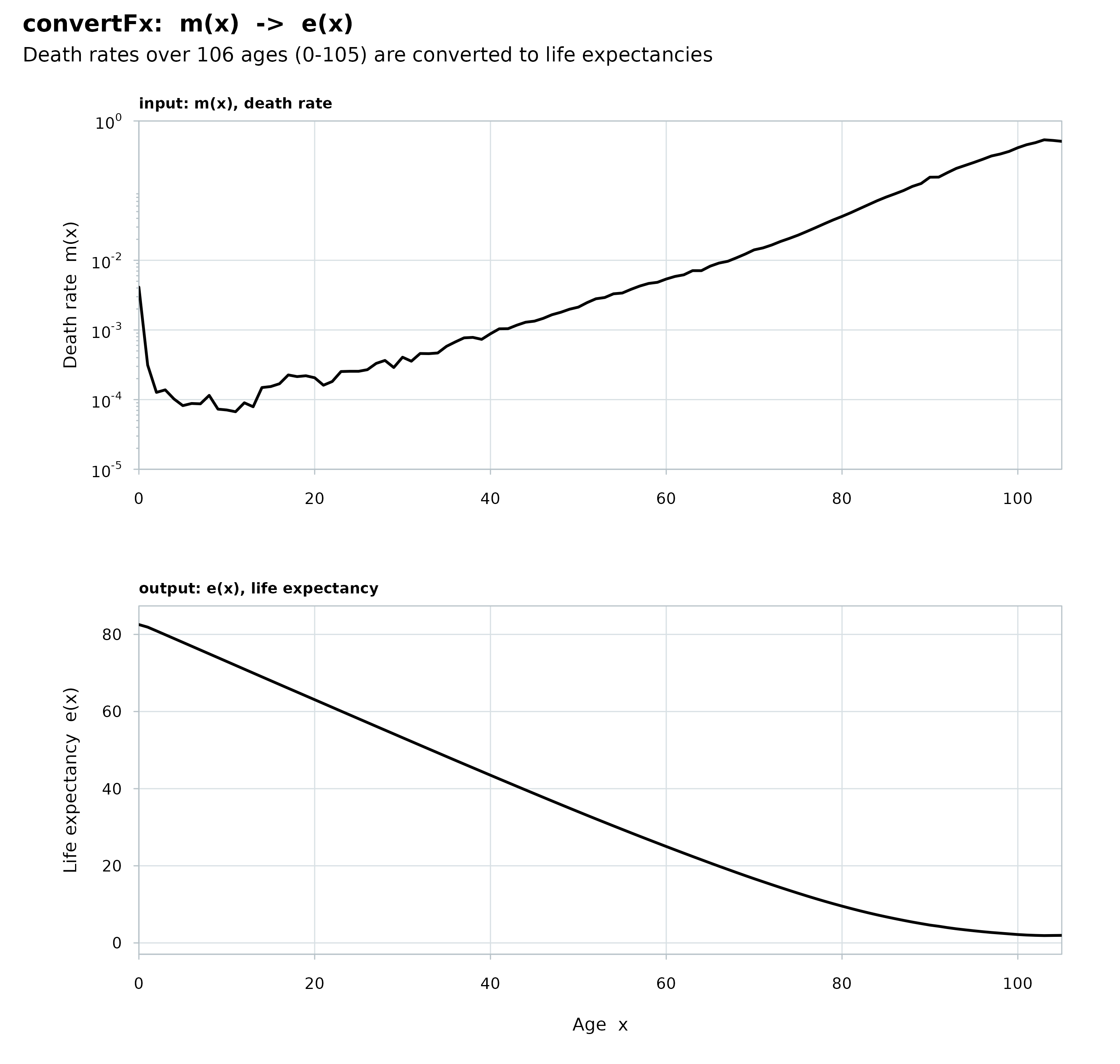
How to arrange the two panels:
NULL(the default) puts them side by side, c(1, 2); give a length-2 integer c(nrow, ncol) to split them yourself, such asc(2, 1)to stack the output under the input on a shared age axis.- ...
Further arguments; currently ignored.
Examples
# convert death rates (mx) to life expectancies (ex)
x <- 0:105
mx <- ahmd$mx[paste(x), "2010"]
ex <- convertFx(x = x, data = mx, from = "mx", to = "ex")
plot(ex)
 plot(ex, split = c(2, 1))
 # convert life expectancy (ex) to 1-year probability of dying (qx)
qx <- convertFx(x = x, data = ex, from = "ex", to = "qx")
plot(qx)
# convert life expectancy (ex) to 1-year probability of dying (qx)
qx <- convertFx(x = x, data = ex, from = "ex", to = "qx")
plot(qx)